Creative Director | Brand, Campaign,
Senior UX/UI Designer & Visual Identity Design Expert

Case Study: Virtual Try On
MY ROLE:
UX UI Direction Guidance
LEAD UX/UI Designer from research to visualization:
Sarah Chase
AR AI TECHNOLOGY:
QUALITY ASSURANCE:
Nusrat Bintun + team
PRODUCT MANAGEMENT:
Theresa Cowing, Wendy Liao
ENGINEER DEVELOPMENT:
Nick Artymiak, Dave Haas
SITE OPERATIONS:
Kelley Coleman, Roma Desai
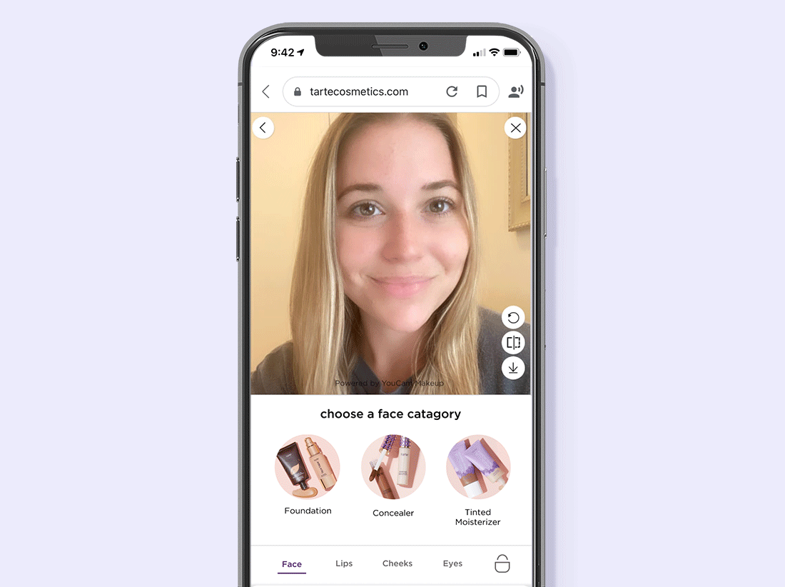
Thanks to augmented reality, discovering your favorite lipstick, blush or foundation shade online has never been easier. Virtual try-on leverages AI & AR technology allowing an online user to “try-on” a makeup product using any device equipped with a camera. With the assimilation of virtual try on to tarte.com, consumers can try on the latest and greatest products from the comfort of their home (that’s right, no beauty counter needed!)
01
Our Challenge
The tarte e-comm team was challenged to bring the in-store shopping experience virtual. Our goal was to effectively incorporate Perfect Corp’s virtual try-on technology within tarte’s e-commerce shopping journey. The VTO experience should allow the user to try on and explore a range of makeup products at once. The customer should be able to pair different products together to get a full face look they love, subsequently increasing conversion across tarte.com
02
The Process
Competitive analysis:
to determine strengths and weaknesses of current virtual try-on experiences across the beauty industry
Gather site metrics
including products with high site interaction, customer service responses, and current shade matching shortcomings.
Define project parameters including:
AI AR technology limitations and code restrictions from our current e-comm platform
User journey map:
translate this information into a user journey map (see below).


03
Low Fidelity Mocks
Once we understood the general VTO journey and the necessary functionality, Sarah began designing low-fidelity mocks. The mockups went threw multiple design iterations, primarily changing the information hierarchy so all details sit above the fold on mobile.
04
High Fidelity Mocks
After the team aligned on the low-fidelity mocks, Sarah proceeded with high-fidelity mocks. I used existing brand guidelines for the product detail images, typography, colors, and CTA buttons.

05
User Testing
We chose to perform user testing after completing the high fidelity mocks to ensure users could interact with the most flushed out design. I guided focus groups through a try-on scenario to determine whether users could successfully follow. Afterwards participants completed a survey and engaged in feedback through a group discussion. Below are design modifications based off of user testing findings.
06
Results
200% increase in sales when customers use virtual try-on
Triple digit increase in time spent on site
30% increase in add-to-bag
Double-digit reduction in customer service inquiries for help with shade matching